Strategic Rebranding Case Study: Milky Mist
- Akshaya Srinivasan
- Dec 15, 2025
- 4 min read
Every iconic brand begins with a compelling origin story, and Milky Mist’s journey is one of the most inspiring. What started as the determined pursuit of a young teenager has grown into one of India’s most influential dairy brands. With its refreshed identity and packaging, Milky Mist now stands as a strong example of how thoughtful design can shape a brand’s future. This strategic rebranding case study of Milky Mist illustrates how clarity, scale, and modern relevance can be effectively combined through design.
From Humble Beginnings to a Vision Larger Than Life
In 1992, a young and curious Mr. Sathish Kumar T made the bold decision to leave school, support his family, and revive his father’s milk distribution business. With access to fresh milk and an unwavering desire to create something larger, he began experimenting with paneer production, a product then considered a luxury in South India.
His aim was rare for the time: to make paneer an everyday essential. After numerous trials, he perfected the product and set out to popularize it across the South. By positioning paneer as a meat alternative in restaurants and offering tasting opportunities, he helped build demand that later moved from eateries into retail.
A Brand Is Born
In the mid-90s, the absence of a formal brand name brought challenges. After being rejected by the then-popular Food World chain, he understood the importance of identity and introduced the name Milky Mist in 1995. This became a decisive turning point.

Milky Mist went on to become the first dairy brand in India to provide chillers to retailers, strengthening both product quality and visibility. As the portfolio expanded to include paneer, curd, butter, ghee, and more, the brand established a firm presence across South India.
Building a Modern Dairy Empire
From a small-town venture, Milky Mist has grown into a state-of-the-art, fully automated dairy powerhouse operating from a vast 57-acre facility in Perundurai. With 500 employees, direct involvement of 56,000 farmers, and the capability to produce 60,000kg of paneer every day, the brand operates at a remarkable scale.
Automation, green energy systems, and a 100 percent water recovery model reflect their commitment to uncompromised quality and sustainability. With nationwide success, Milky Mist is now preparing for global expansion, introducing products such as cream cheese, cheddar, mozzarella, UHT offerings, and more.

A Brand Refresh That Mirrors Growth
With its new identity and packaging, Milky Mist reinforces the importance of evolving with time.
A brand refresh helps:
Reinforce relevance
Strengthen customer trust
Align the visual identity with long-term goals
Signal growth and adaptability

Why the Rebranding Works
The original logo served its purpose when Milky Mist operated in a smaller regional market. Its cheerful, bouncy style reflected the emotional warmth of the products themselves—a comforting cup of milk on a rainy day, soft and springy paneer in a favourite dish, or creamy butter on freshly made bread. As the company expanded, both in scale and in the diversity of its audience, the need for a refreshed identity became clear. The brand had to evolve from a friendly neighbourhood presence to a more confident, bold, yet approachable identity that resonated across wider demographics. This shift strengthens its appeal in modern retail environments while positioning Milky Mist to compete effectively with national players such as Amul, Godrej, and ITC across multiple categories.
This strategic rebranding case study: Milky Mist highlights how a modernised identity can unlock new territory and elevate a legacy brand within a competitive FMCG landscape.
Strategic Rebranding Case Study: Milky Mist – Design Insight
For a household brand like Milky Mist, refreshing its visual language creates a stronger connection with today’s consumers while respecting the legacy it has built over decades.
The Man Behind the Brand
Mr. Sathish Kumar describes himself as his own role model, committed to moving at least one step forward every day. From overcoming communication barriers to securing loans and building an industry-leading enterprise from a small town, his journey reflects resilience and clarity of purpose.

His factory encourages public visits, especially from students and senior citizens, reinforcing his belief in transparency and shared learning. Milky Mist’s direct procurement model eliminates middlemen, ensuring consistent quality and fair support for farmers. Consumer feedback has shaped their 25-plus product portfolio while maintaining a zero-waste facility.
With a turnover exceeding ₹1200 crores, Milky Mist stands as a story built on passion, innovation, and integrity.
Expanding Through Innovation
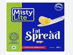
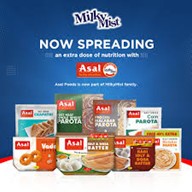
Milky Mist’s growth is shaped by its ability to adapt to changing consumer needs. The introduction of sub-brands like Misty Life, Briyas, Asal, and Smart Chef reflects a clear design and strategy mindset.


7 strategies that Milky Mist uses for sub-branding
Serve different consumer segments with clarity and focus
Build distinct identities for specialised product lines
Explore new categories without diluting the core brand
Position products based on lifestyle, value, or usage occasions
Strengthen presence across retail shelves with multiple touchpoints
Innovate freely in packaging, design language, and communication
Create structured brand architecture for long-term scalability
This approach ensures that each product speaks to the right audience, carries the right message, and fits into a cohesive yet flexible brand ecosystem.
About This Blog
8020 Design Studio writes articles that help entrepreneurs understand how branding, communication, and design influence business growth. Each piece explores real brand journeys, strategic decisions, and the role design plays in shaping perception, making it easier for founders and marketers to navigate their own communication choices with clarity.


Comments