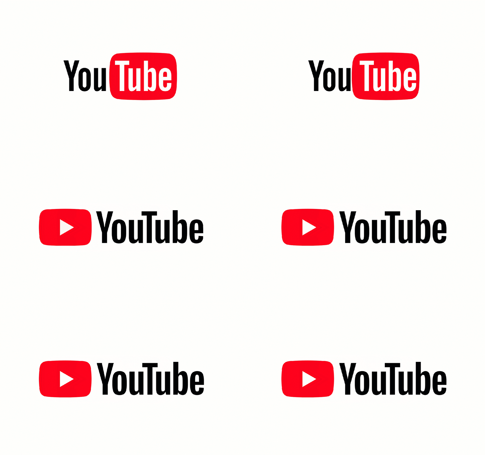
YouTube Refreshed.
YouTube after nearly a decade had a brand refresh rolled out earlier today.
The earlier 'red' part of the logo is supposed to represent a tube. Have you ever wondered why the word 'Tube'?

“We have the word tube in a tube,...this is weird.
No one knows what this is.”
says Christopher Bettig, HEAD OF ART - YOUTUBE
The Tube is a slang for TV sets which earlier were powered by vacuum tubes.
Today billions of people are watching videos across the globe in YouTube. Since the brand has evolved from just being a video streaming service to offering advertisements, music, movies and live streaming of shows catering to all age groups, YouTube's Art Team saw the need to refresh the brand to suit to the current trend and services. It also needed to look at the future of the brand as well.
“It’s an evolution, not a revolution.”
says Christopher Bettig, HEAD OF ART - YOUTUBE

Evolution is tweaking the brand but retaining the heart and soul of it whereas revolution is completely redesigning everything from scratch. Earlier when the logo was designed, scalability of the identity was never part of the logo design. The 'U' in You and 'U' in Tube are manually adjusted, same goes to the tube icon. The four corners of the icon were not rounded at the same angle.
Now the new logo is a evolution of the old nostalgic YouTube logo. The typeface is designed from scratch, they wanted to create something new which reminded us of the VHS era and tie it with the now digital age but at the end the settled with a more print-like typeface. The colour is also meticulously chosen to represent videos and #FF0000 red was chosen. The UI part of the brand is also tweaked for scalability.
The YouTube logo has been refreshed beautifully retaining the nostalgic elements so that people from all generations will always
have a sense of attachment to the brand.
Let us know what you think of the refreshed logo?


